Top 10 Website Mistakes That Kill Your Conversions (and How to Fix Them)
In the competitive world of online business, your website is often the first — and sometimes the only — impression you make on potential customers. But here’s the reality: even the most beautiful websites can fail miserably at converting visitors into buyers if certain critical mistakes are made.
Whether you’re a small business owner, a startup founder, a freelance designer, or an eCommerce seller, avoiding these conversion-killing website mistakes can mean the difference between a thriving online business and a digital ghost town.
Let’s dive deep into the top 10 website mistakes that kill your conversions — and more importantly, how to fix them fast.
1. Slow Website Loading Speed
Why It’s a Problem:
A slow-loading website is like a store with a locked door — visitors won’t wait around. Research shows 53% of visitors leave if a site takes more than 3 seconds to load.
How to Fix:
Use tools like Google PageSpeed Insights or GTmetrix to test speed.
Compress images without losing quality using tools like TinyPNG.
Use a fast, reliable hosting provider.
Minimize code bloat (CSS, JS, HTML).
💡 Pro Tip: A faster site not only boosts conversions but also improves your SEO rankings.
2. Poor Mobile Optimization
Why It’s a Problem:
Over 60% of web traffic is mobile. If your site looks broken or is hard to navigate on mobile devices, you’re losing potential buyers instantly.
How to Fix:
Use a responsive design that adapts to all screen sizes.
Test your website on multiple devices.
Avoid tiny text and buttons — keep it thumb-friendly.
3. Weak or Confusing Call-to-Actions (CTAs)
Why It’s a Problem:
If visitors don’t know what to do next, they won’t do anything at all.
How to Fix:
Make CTAs clear, action-oriented, and visible above the fold.
Use power words like “Get Started Now” or “Claim Your Free Trial”.
Limit the number of CTAs per page to reduce decision fatigue.
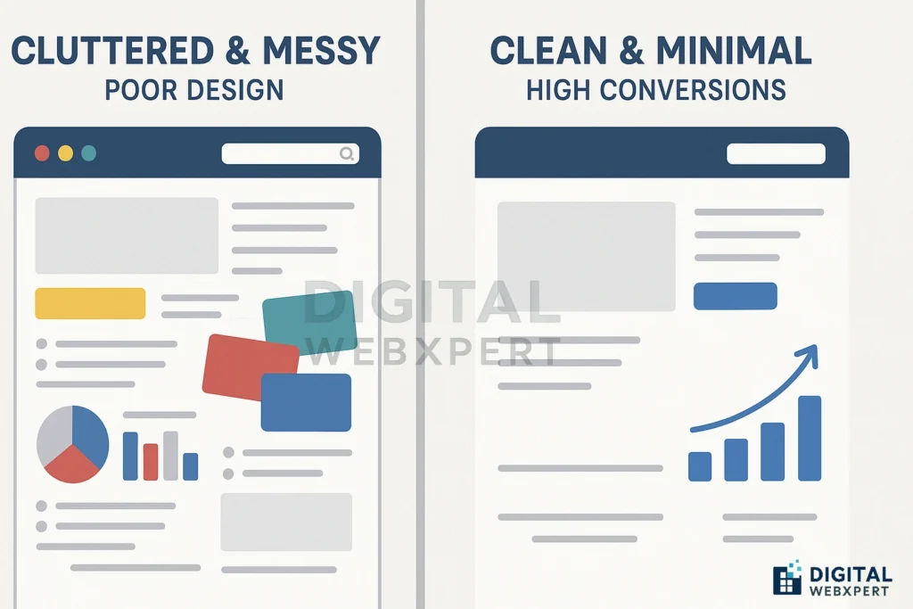
4. Cluttered Design and Layout
Why It’s a Problem:
Too much information at once overwhelms visitors and distracts from your main message.
How to Fix:
Embrace white space for breathing room.
Use a visual hierarchy to guide the eye.
Keep consistent colors, fonts, and styles.
5. Lack of Trust Signals
Why It’s a Problem:
People won’t give you their money unless they trust you.
How to Fix:
Display customer testimonials, reviews, and case studies.
Show security badges for checkout.
Include an About Us page with real photos.
6. Poor Navigation Structure
Why It’s a Problem:
If users can’t find what they’re looking for quickly, they’ll leave.
How to Fix:
Limit main menu items to 5–7 options.
Add a search bar.
Use clear category names instead of jargon.
7. No Clear Value Proposition
Why It’s a Problem:
If you don’t clearly explain why you’re the best choice, people will choose your competitor.
How to Fix:
Have a strong headline that communicates your unique value.
Focus on benefits, not just features.
Use compelling visuals to reinforce your message.
8. Ignoring SEO Basics
Why It’s a Problem:
If your target audience can’t find you on Google, your conversions won’t even have a chance to happen.
How to Fix:
Use focus keywords in titles, descriptions, and headings.
Optimize image alt texts and URLs.
Create SEO-friendly blog content to attract organic traffic.
9. Overcomplicated Forms
Why It’s a Problem:
Long forms scare people away. Every extra field reduces the chance of completion.
How to Fix:
Only ask for essential information.
Use autofill and dropdown menus for ease.
Show progress indicators for multi-step forms.
10. Not Tracking User Behavior
Why It’s a Problem:
If you don’t know where people are dropping off, you can’t fix it.
How to Fix:
Install Google Analytics and Hotjar for heatmaps.
A/B test different versions of your pages.
Continuously optimize based on real data.
Final Thoughts
Avoiding these website mistakes that kill your conversions is not just about making your site “look good” — it’s about creating an optimized, user-friendly experience that guides visitors naturally toward taking action.
Remember, conversion optimization is an ongoing process. Review your site regularly, keep testing, and never stop improving.
If you need professional help, Digital Webxpert specializes in web design, SEO, and conversion optimization to turn your website into a powerful sales machine.